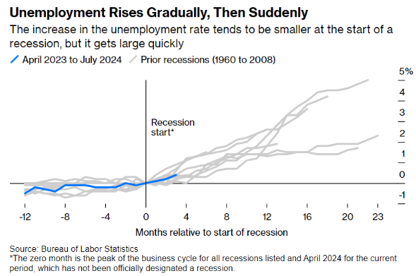
This week’s chart examines the path of unemployment rates leading into a recession from 1960 through 2008 and compares it to the current labor market. It’s important to note that we are not currently in a recession, but this chart illustrates what the unemployment rate could look like if we were entering a recession. In previous recessions from 1960 through 2008, the unemployment rate showed slow growth, a negative indicator, and then increased at a much higher rate.