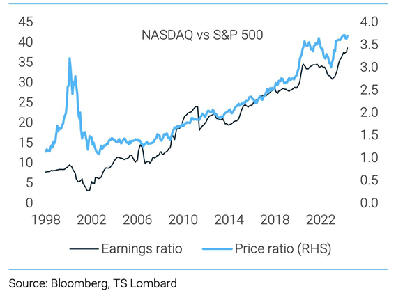
The chart of the week compares the NASDAQ and S&P 500 since 1998. Some investors are concerned that the recent dominance of large-cap growth/tech companies could lead to another Dotcom bubble. However, when we look at the recent earnings of the NASDAQ compared to the S&P 500, they are very much in line with the long-term trend between the two indices. This consistency in price and earnings is reassuring and indicates that a bubble similar to the one in the late 90s is not forming. During the late 90s bubble, the price ratio for the pair deviated significantly from the earnings, and we all know the result of those conditions.